Thu 6 Nov, 2008
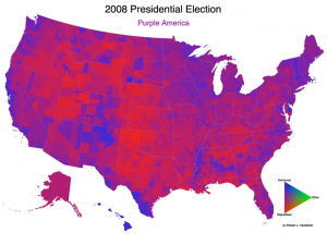
Here, courtesy of Robert J. Vanderbei of Princeton, is the current electoral map of the United States:
This map is always a much better visual presentation of the political division of the country than the traditional, state-by-state electoral map. It uses county-by-county data to provide a more nuanced look at which regions of the country voted Republican or Democatic.
From a lay perspective, the power of this map is primarily its reminder that our states are much more diverse politically than the state-by-state electoral map suggests. There are areas that are strongly red or blue, and areas that are distinctly purple in their outlook. Moreover, there are many counties which are strongly red or blue within states that vote strongly in the other direction, a fact which is often overlooked in election commentary.
(For my money, the most striking electoral maps are those which show that rural areas vote Republican in every area of the country, while urban areas consistently vote Democratic. The message is that our political divisions aren’t about regional politics or culture, but about rural and urban differences.)

The United States is a purple country | The Living Consequences says:
[…] I mentioned four years ago, this is a much more accurate and revealing look at the nation’s geographic political […]