Thu 8 Nov, 2012
The United States is a purple country
Comments (4) Filed under: PoliticsTags: Presidential election
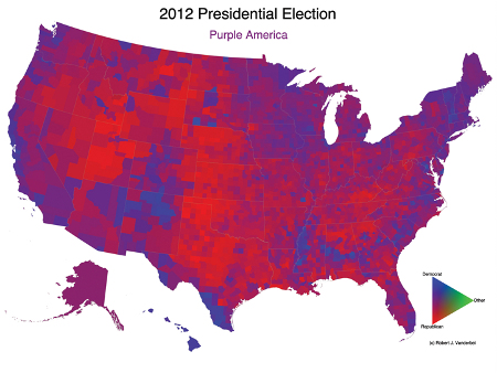
Once again, Bob Vanderbei of Princeton has offered the nation a view of itself as the purple country that it is:

As I mentioned four years ago, this is a much more accurate and revealing look at the nation’s geographic political divisions than the more conventional state-by-state, red-and-blue map. It emphasizes how politically diverse many states are, and how there are red, blue, and purple areas throughout the country.
The county-level data revealed by this map also hints at an important truth that state-by-state color-coding doesn’t: that in terms of geography, our society’s political leanings track closely with not only broad geographic areas, but also with coastal and inland terrain and with urban and rural settings.
Stawki Podatkowe says:
That's interesting point of view. Good data and conclusions.
DShirley says:
I believe we need to peel the onion back on this some more. We need to look at "income" level of these "purple" areas and by race to see any connections or patterns of voting. Also, if one were to overlay this with our Jerry Mandered political boundaries, it would also be revealing in terms of assessing political "outcomes"….
James DeWolf Perry says:
That's a very interesting thought.
We do know something about how income level affects partisan voting in the U.S. In particular, the poor tend to vote Democratic and the rich tend to vote Republican, with the middle class relatively split.
This nationwide trend, though, doesn't do much to illuminate the geography of voting, as illustrated by this map. The reason is that geographic factors, such as culture, tend to outweigh the ways in which income is distributed on a broad geographic scale (generally along urban-rural lines).
For instance, on a map at this scale, income tends to be concentrated in urban areas, and the rural areas are generally the least affluent. Yet the larger rural stretches of the country tend to be culturally predisposed to vote conservatively (and rural voters are, in any part of the country, more likely to be vote conservatively than their income level alone would predict). Meanwhile, the more urban areas of this map are generally concentrated in the liberal regions of the country, and while urban areas as a whole tend to have more wealth, the votes of middle- and upper-income liberals in urban areas are supplemented by large numbers of poor and working-class urban voters.
As for gerrymandering, political science research shows that gerrymandering does tend to be benefit the party drawing the lines, but not by very much. Again, it's not that gerrymandering has no effect, but that its effect is quite small compared to factors like incumbency, or to what non-partisan boundary-drawing would achieve.
bobbo says:
"As for gerrymandering, political science research shows that gerrymandering does tend to be benefit the party drawing the lines, but not by very much. Again, it's not that gerrymandering has no effect, but that its effect is quite small compared to factors like incumbency, or to what non-partisan boundary-drawing would achieve. " /// I'm sure you have read that, but are you sure/how can you tell? AFTER a gerrymandered district elects its candidate then two years later they are the incumbent==in the SAME gerrymandered district. How can you tell one factor from the other?? Lots of talk about having "no primary/party" district elections in order to get the "hard core base" out of the over influencing department. It doesn't take too many incumbents SECURE in their gerrymandered districts to prevent the 90% from representing the public's clearly expressed interest. Must be another of those intertwined issues?
Your review of the Office is worth a second read. Like some great sperm whale—its too large to attack!